SUMMARIES AND CHARTS
What this document covers
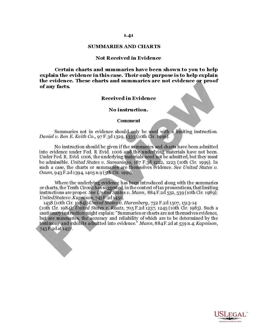
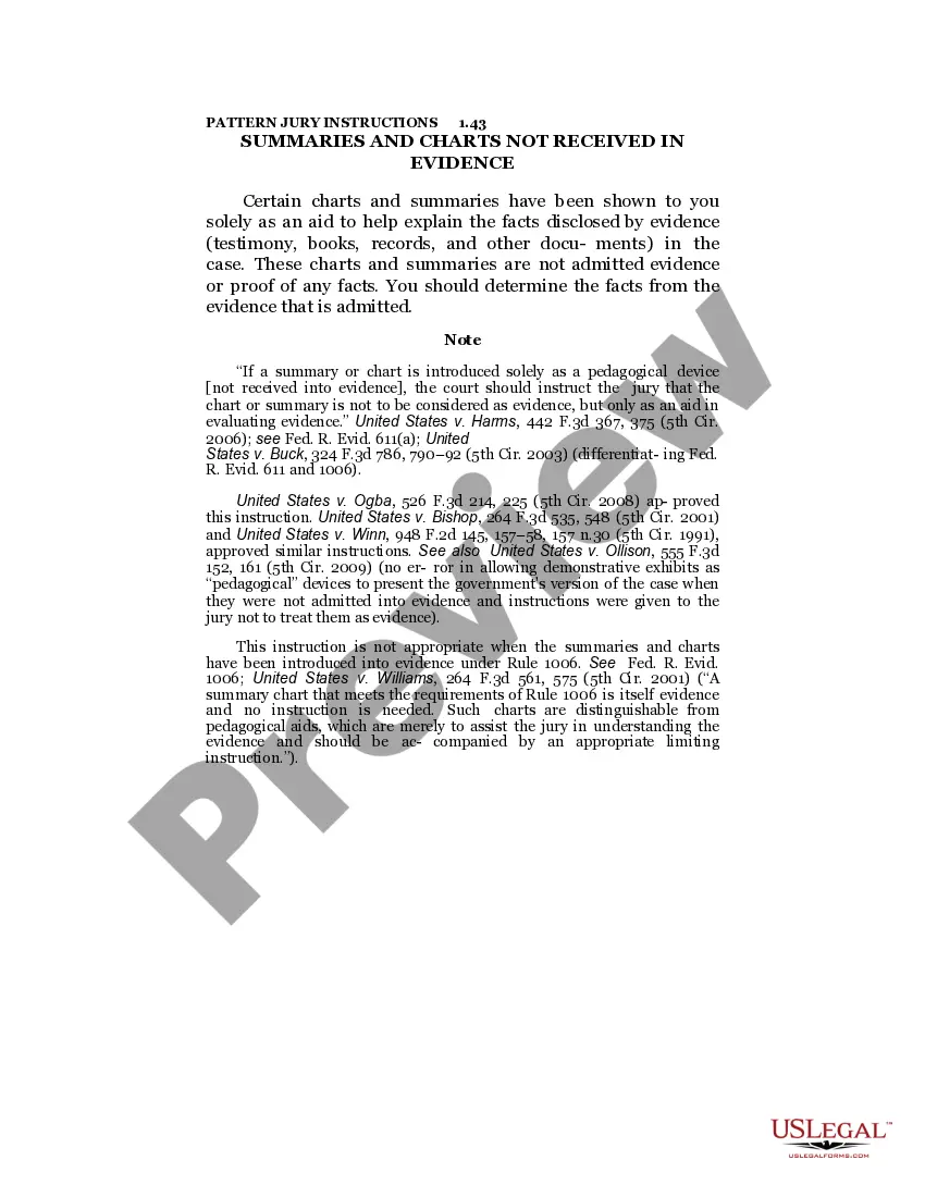
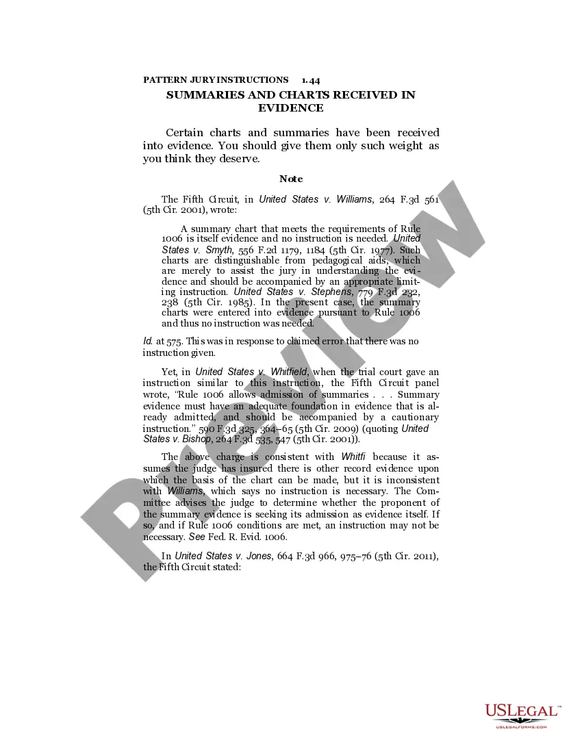
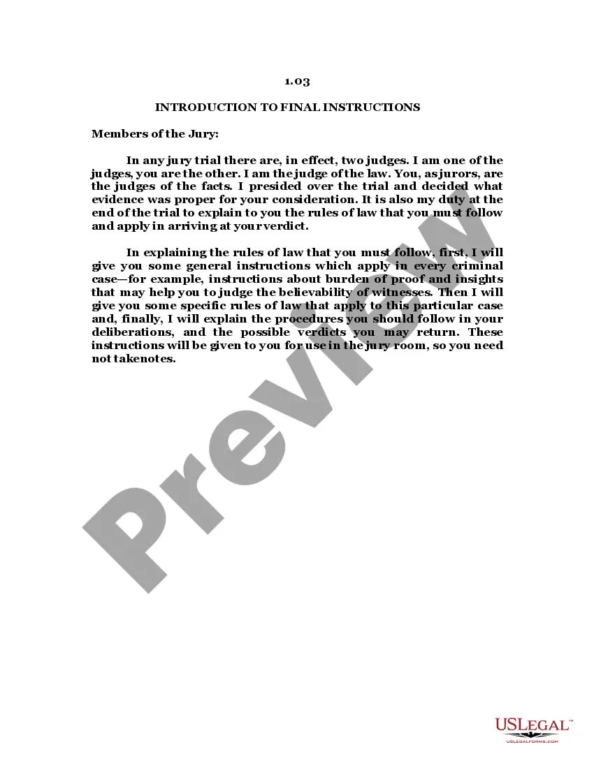
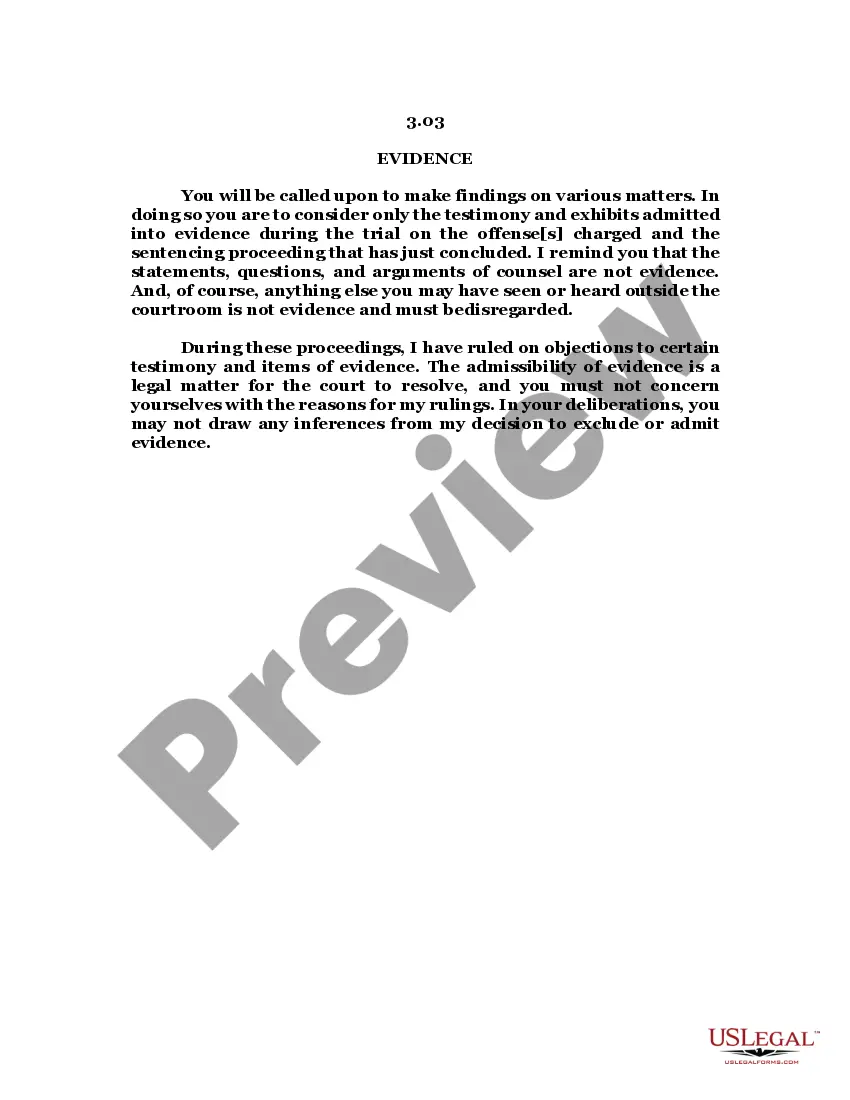
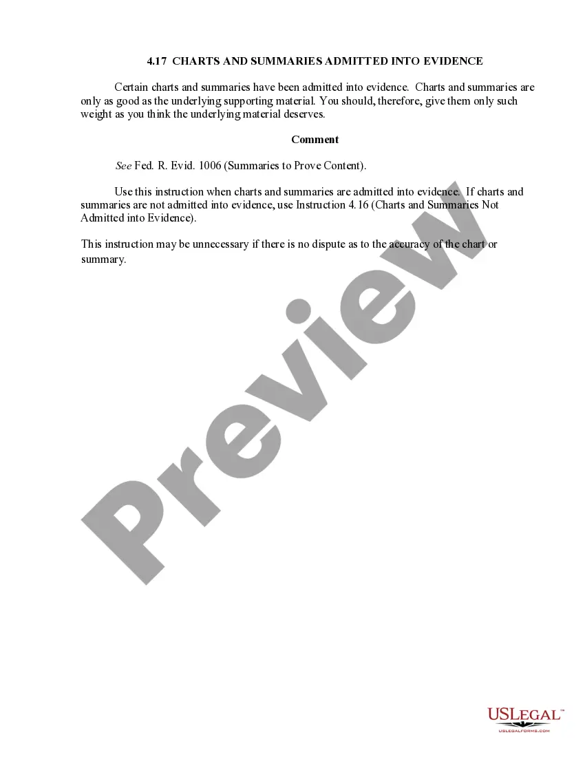
The Summaries and Charts form is a legal document outlining guidelines for the use of visual aids in a courtroom setting. These visual aids, such as charts and summaries, are designed to assist jurors in understanding evidence presented during a trial. It is important to note that these aids are not considered evidence themselves unless admitted under specific legal standards. This form differs from other legal documents as it focuses specifically on the admissibility and context of illustrative materials in legal proceedings.
What’s included in this form
- Definition of charts and summaries: Clarifies their purpose and limitations as non-evidence unless allowed by law.
- Guidance on limiting instructions: Details on when and how to instruct jurors regarding the use of non-evidence aids.
- Reference to applicable legal standards: Cites rules under Federal Rules of Evidence that govern the use and admissibility of visual aids.
When to use this document
This form is used by legal professionals during trial proceedings when graphical representations of evidence are being presented. It is particularly relevant in situations where the complexity of evidence requires clarification or simplification for jurors, such as in cases involving financial records, scientific data, or extensive documentation. It helps ensure that jurors can accurately interpret the information provided to them.
Intended users of this form
- Attorneys representing clients in civil or criminal trials.
- Legal assistants and paralegals preparing trial materials.
- Judges overseeing cases where visual aids are presented as part of the evidence.
How to prepare this document
- Identify the visual aids to be used: Determine which charts or summaries will help clarify the evidence.
- Review legal standards: Ensure that the underlying materials are admissible under Federal Rules of Evidence.
- Prepare limiting instructions: Draft clear instructions to inform jurors that the visual aids are not evidence by themselves.
- Present materials in court: Introduce the charts or summaries during the appropriate stage of the trial.
- Monitor juror understanding: Be prepared to clarify the information and its context if necessary.
Notarization requirements for this form
This form does not typically require notarization unless specified by local law. Be sure to check the relevant rules in your jurisdiction to confirm.
Get your form ready online
Our built-in tools help you complete, sign, share, and store your documents in one place.
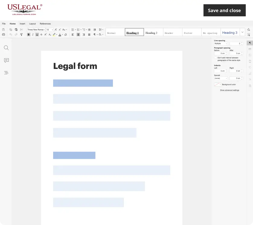
Make edits, fill in missing information, and update formatting in US Legal Forms—just like you would in MS Word.
Download a copy, print it, send it by email, or mail it via USPS—whatever works best for your next step.
Sign and collect signatures with our SignNow integration. Send to multiple recipients, set reminders, and more. Go Premium to unlock E-Sign.
If this form requires notarization, complete it online through a secure video call—no need to meet a notary in person or wait for an appointment.
We protect your documents and personal data by following strict security and privacy standards.
Make edits, fill in missing information, and update formatting in US Legal Forms—just like you would in MS Word.
Download a copy, print it, send it by email, or mail it via USPS—whatever works best for your next step.
Sign and collect signatures with our SignNow integration. Send to multiple recipients, set reminders, and more. Go Premium to unlock E-Sign.
If this form requires notarization, complete it online through a secure video call—no need to meet a notary in person or wait for an appointment.
We protect your documents and personal data by following strict security and privacy standards.
Mistakes to watch out for
- Failing to provide limiting instructions when using non-admitted visual aids.
- Using charts or summaries that do not comply with evidentiary standards.
- Neglecting to educate jurors about the intended use and limitations of visual aids.
Why use this form online
- Convenience: Access and download the form at your convenience, without needing to visit a law office.
- Editability: Customize the document as needed to fit the specifics of your case.
- Reliability: Ensure that you are using an attorney-drafted document that meets legal standards.
Legal use & context
- Charts and summaries presented as visual aids are only admissible if they meet certain legal standards.
- Misuse of these materials can lead to objection from opposing counsel and potential court sanctions.
- Understanding the legal basis for the admissibility of these aids can bolster a case in court.
Key takeaways
- Use this form to understand how to effectively present visual aids in court.
- Ensure compliance with legal standards to avoid issues during trial.
- Clearly educate jurors on the context and limitations of the information presented through charts or summaries.
Looking for another form?


Form popularity
FAQ
Box plots show distribution based on a statistical summary, while column histograms are great for finding the frequency of an occurrence. Scatter plots are best for showing distribution in large data sets.
Scatterplots. A scatterplot displays data that is paired by using a horizontal axis (the x-axis), and a vertical axis (the y-axis). The statistical tools of correlation and regression are then used to show trends on the scatterplot.
In addition to tracking the sales of your products in full, you may want to chart the separate categories to gauge each one's relative success. You can do this by creating a summary chart, which uses subtotals from columns of data rather than data in individual cells.
The Summary Chart is a chart type that can be used to present and summarize data from spreadsheets in the layout. A Summary chart can graph summary statistics such as the Mean or the Median, the distribution of the data, the Outliers and Single Data Points.
Following are the best chart types for summarizing time-based data in Excel: Line chart. Clustered column chart. Combination chart.
If the independent and dependent variables are numeric, use line diagrams or scattergrams; if only the dependent variable is numeric, use bar graphs; for proportions, use bar graphs or pie charts.
A "boxplot", or "box-and-whiskers plot" is a graphical summary of a distribution; the box in the middle indicates "hinges" (close to the first and third quartiles) and median.