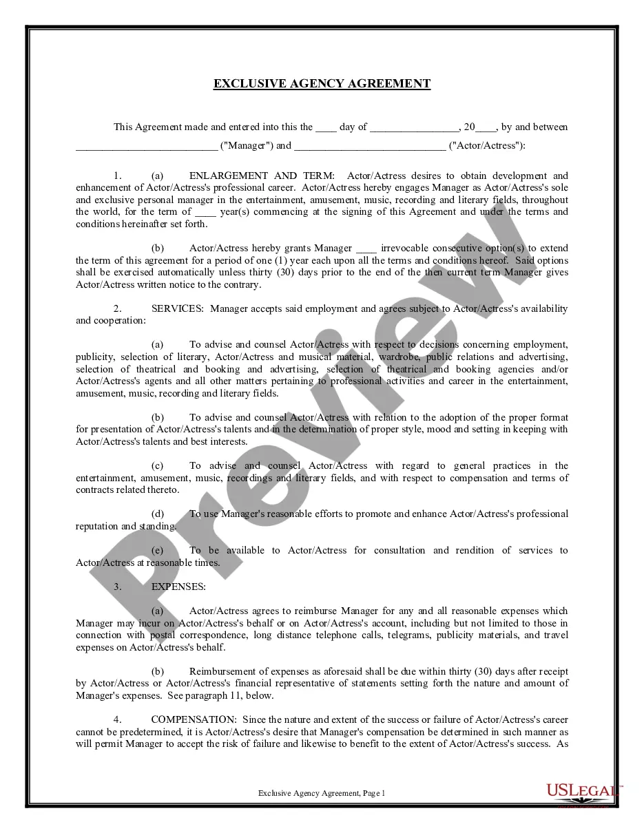
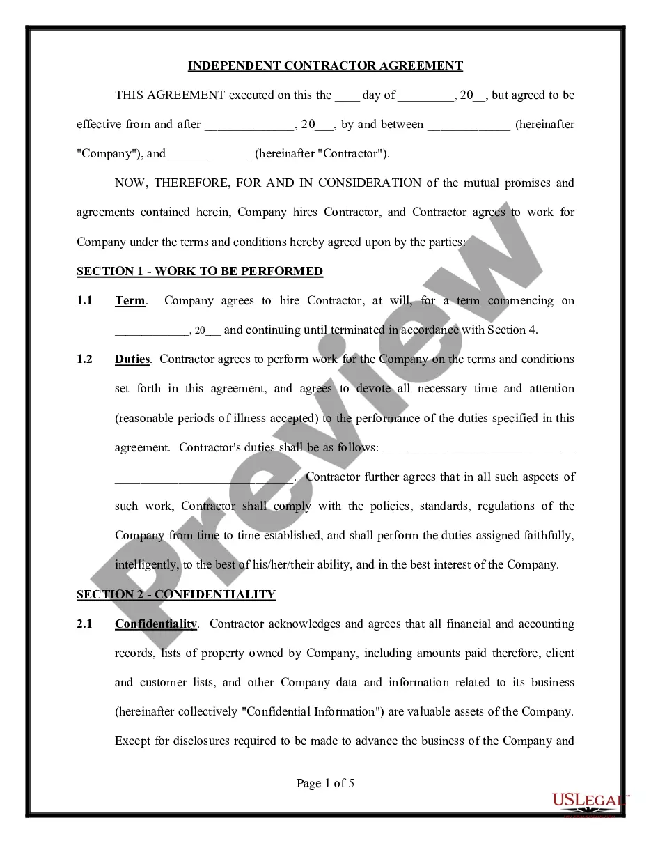
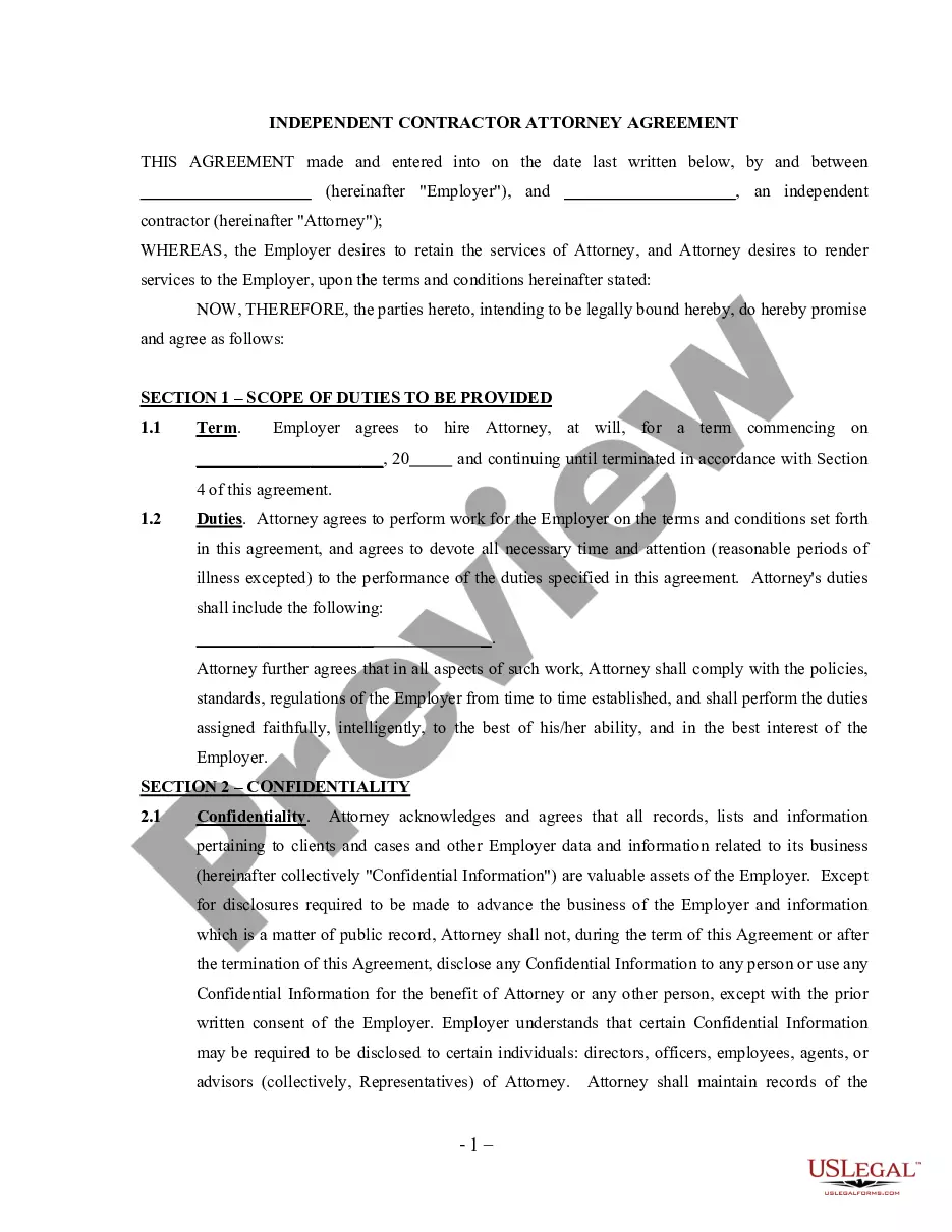
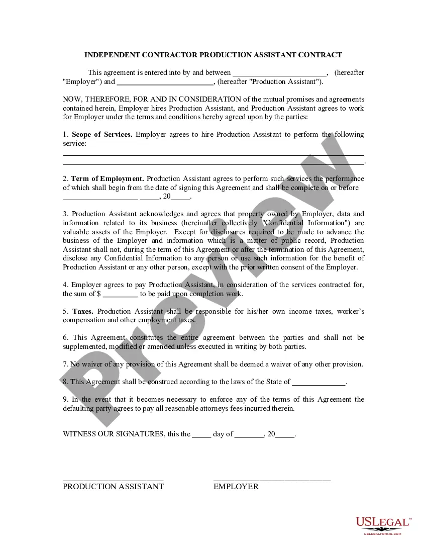
Actor Form Template With Bootstrap
Description


Get your form ready online
Our built-in tools help you complete, sign, share, and store your documents in one place.
Make edits, fill in missing information, and update formatting in US Legal Forms—just like you would in MS Word.
Download a copy, print it, send it by email, or mail it via USPS—whatever works best for your next step.
Sign and collect signatures with our SignNow integration. Send to multiple recipients, set reminders, and more. Go Premium to unlock E-Sign.
If this form requires notarization, complete it online through a secure video call—no need to meet a notary in person or wait for an appointment.
We protect your documents and personal data by following strict security and privacy standards.
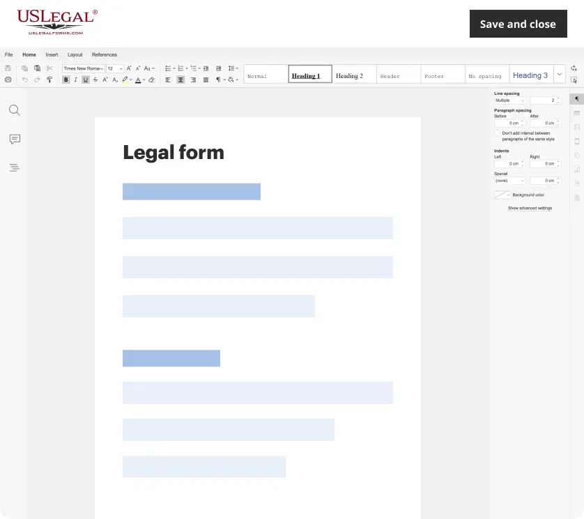
Make edits, fill in missing information, and update formatting in US Legal Forms—just like you would in MS Word.
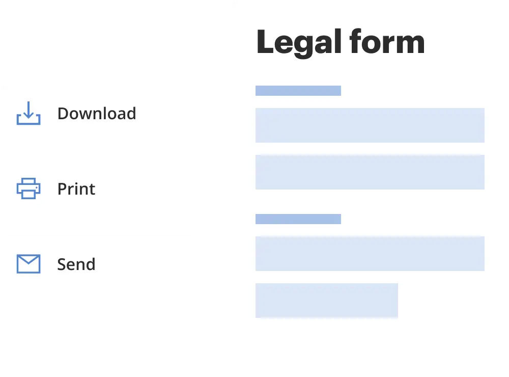
Download a copy, print it, send it by email, or mail it via USPS—whatever works best for your next step.
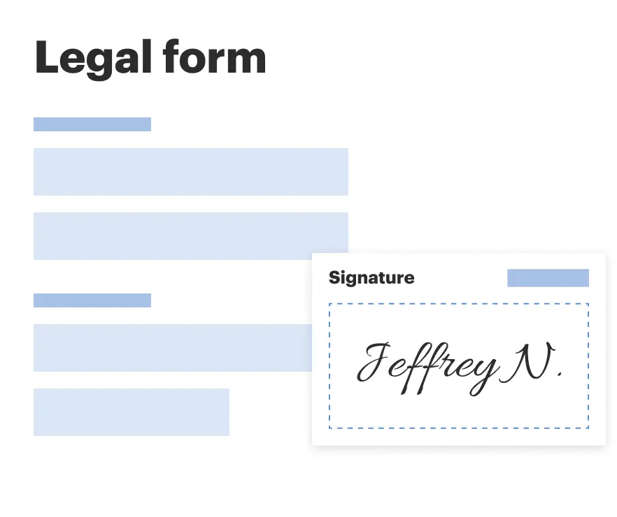
Sign and collect signatures with our SignNow integration. Send to multiple recipients, set reminders, and more. Go Premium to unlock E-Sign.
If this form requires notarization, complete it online through a secure video call—no need to meet a notary in person or wait for an appointment.
We protect your documents and personal data by following strict security and privacy standards.
Looking for another form?

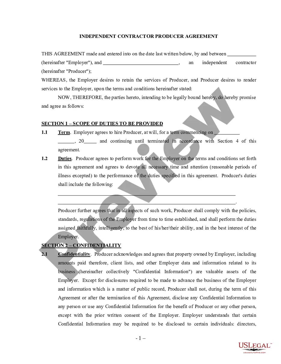
How to fill out Actor - Actress Employment Agreement - Self-Employed Independent Contractor?
The Actor Form Template With Bootstrap you see on this page is a reusable legal template drafted by professional lawyers in line with federal and state laws and regulations. For more than 25 years, US Legal Forms has provided people, companies, and legal professionals with more than 85,000 verified, state-specific forms for any business and personal occasion. It’s the quickest, easiest and most trustworthy way to obtain the paperwork you need, as the service guarantees the highest level of data security and anti-malware protection.
Getting this Actor Form Template With Bootstrap will take you only a few simple steps:
- Look for the document you need and review it. Look through the sample you searched and preview it or check the form description to confirm it suits your needs. If it does not, make use of the search bar to get the appropriate one. Click Buy Now when you have located the template you need.
- Subscribe and log in. Opt for the pricing plan that suits you and create an account. Use PayPal or a credit card to make a quick payment. If you already have an account, log in and check your subscription to proceed.
- Acquire the fillable template. Choose the format you want for your Actor Form Template With Bootstrap (PDF, Word, RTF) and save the sample on your device.
- Complete and sign the paperwork. Print out the template to complete it manually. Alternatively, use an online multi-functional PDF editor to rapidly and precisely fill out and sign your form with a valid.
- Download your paperwork one more time. Make use of the same document again anytime needed. Open the My Forms tab in your profile to redownload any earlier downloaded forms.
Subscribe to US Legal Forms to have verified legal templates for all of life’s situations at your disposal.
Form popularity
FAQ
Create horizontal forms with the grid by adding the .row class to form groups and using the .col-*-* classes to specify the width of your labels and controls. Be sure to add .col-form-label to your <label> s as well so they're vertically centered with their associated form controls.
CSS does not provide responsive pages or website. In Bootstrap we can design a responsive website or webpages. CSS is more complex than Bootstrap because there is no pre-defined class and design. Bootstrap is easy to understand and it has much pre-design class.
1. Set ip a React application. npx create-react-app <name-of-your-app-here> cd <name-of-app> npm start. npm bootstrap. yarn add bootstrap. import 'bootstrap/dist/css/bootstrap. css'; Note: It's important to import Bootstrap at the top of your app's entry file before other CSS files.
Create a Theme: "Company" This page will show you how to build a Bootstrap theme from scratch. ... HTML Start Page. We will start with the following HTML page: ... Add Bootstrap CDN and Add a Jumbotron. ... Add Background Color and Center Text. ... Add Form. ... Add Containers. ... Add Padding. ... Add a Grid.
The .form-group class is the easiest way to add some structure to forms. It provides a flexible class that encourages proper grouping of labels, controls, optional help text, and form validation messaging. By default it only applies margin-bottom , but it picks up additional styles in .form-inline as needed.