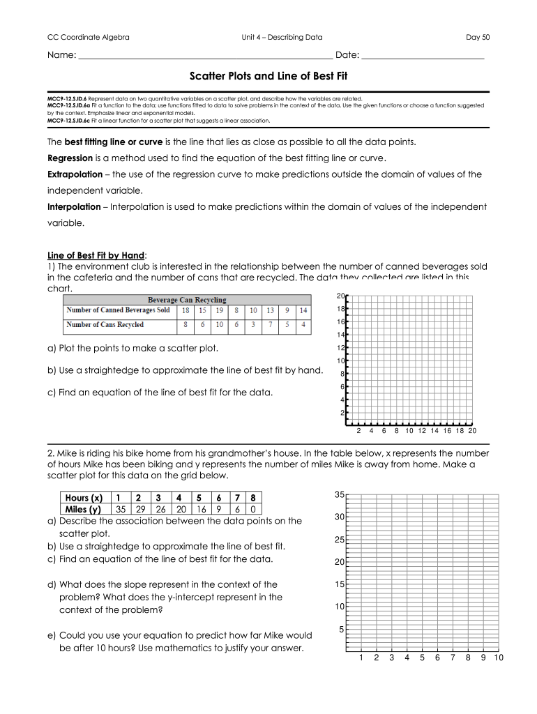
CC Coordinate Algebra Unit 4 Describing Data Day 50 Name: Date: Scatter Plots and Line of Best Fit MCC912.S.ID.6 Represent data on two quantitative variables on a scatter plot, and describe how the.
Loading

Open form follow the instructions

Easily sign the form with your finger

Send filled & signed form or save
How to fill out the CC Coordinate Algebra Unit 4 Describing Data online
Filling out the CC Coordinate Algebra Unit 4 Describing Data form online is a straightforward process that allows users to effectively represent and analyze data using appropriate methods. This guide provides clear, step-by-step instructions to help you complete the form accurately.
Follow the steps to successfully complete the form
- Press the ‘Get Form’ button to access the document and open it in your online workspace.
- Begin by entering your name and the current date in the designated fields at the top of the form. Ensure that the information is accurate and clearly written.
- Locate the section titled 'Scatter Plots and Line of Best Fit'. Familiarize yourself with the learning objectives and tasks, which include plotting data and drawing lines of best fit.
- For each data set provided in the form, follow the instructions: a) Plot the points to create a scatter plot. b) Use a straightedge to approximate the line of best fit based on the plotted data. c) Write the equation of the line of best fit clearly below your plot.
- After completing the data analysis tasks, address any additional questions related to the findings and interpretations of the linear relationships observed.
- Once you have filled out all sections of the form, review your entries for clarity and accuracy.
- When you are satisfied with the completed form, choose to save your changes, download a copy for your records, or print the form for submission.
- If necessary, share the completed form with your instructor or classmates for collaborative review or discussion.
Start completing your CC Coordinate Algebra Unit 4 Describing Data form online today!
Experience a faster way to fill out and sign forms on the web. Access the most extensive library of templates available.
Related content
Represent and interpret data. 4. Make a line plot to display a data set of measurements in...
The development of this OER textbook was initiated by Salt Lake Community. College to...
... 4. VectorSpaces . . . . . . . . . . . . . . . 159. 4.1. SpacesandSubspaces . . . . ....
Get answers to your most pressing questions about US Legal Forms API.
What is a weak negative correlation scatter plot?
Above scatter plot is an example of a weak negative correlation. IN this plot, as the value of x increases the value of y is decreasing, but the pattern doesn't resemble a straight line.
Can scatter plot show negative correlation?
A scatterplot plots points x y axis. Approximately 2 dozen points are rise diagonally in a relatively narrow patterm between (1 half, 1 half) and (9, 7 and 1 half). All values estimated. When the variable tends to decrease as the variable increases, we say there is a negative correlation between the variables.
What is a perfect negative correlation?
In statistics, a perfect negative correlation is represented by the value -1.0, while a 0 indicates no correlation, and +1.0 indicates a perfect positive correlation. A perfect negative correlation means the relationship that exists between two variables is exactly opposite all of the time.
What is a strong negative correlation scatter plot?
The scatter about the line is quite small, so there is a strong linear relationship. The slope of the line is negative (small values of X correspond to large values of Y; large values of X correspond to small values of Y), so there is a negative co-relation (that is, a negative correlation) between X and Y.
What is a scatter plot with no correlation?
When there is no pattern to where the points are going (how they are trending), then it is a no correlation scatterplot. This means that there is no relationship between the two variables.
How do you describe a scatter plot?
A scatterplot shows the relationship between two quantitative variables measured for the same individuals. The values of one variable appear on the horizontal axis, and the values of the other variable appear on the vertical axis. Each individual in the data appears as a point on the graph.
What is a weak negative correlation?
A negative correlation indicates two variables that tend to move in opposite directions. A correlation coefficient of -0.8 or lower indicates a strong negative relationship, while a coefficient of -0.3 or lower indicates a very weak one.
Which type of correlation is suggested by the scatter plot?
Notice that when you look at the scatter plot the points seem to form a line going up from left to right. This means that there is a positive correlation between the -coordinates and the -coordinates. The answer is that the scatter plot shows a positive correlation.
Use professional pre-built templates to fill in and sign documents online faster. Get access to thousands of forms.
If you believe that this page should be taken down, please follow our DMCA take down process here.