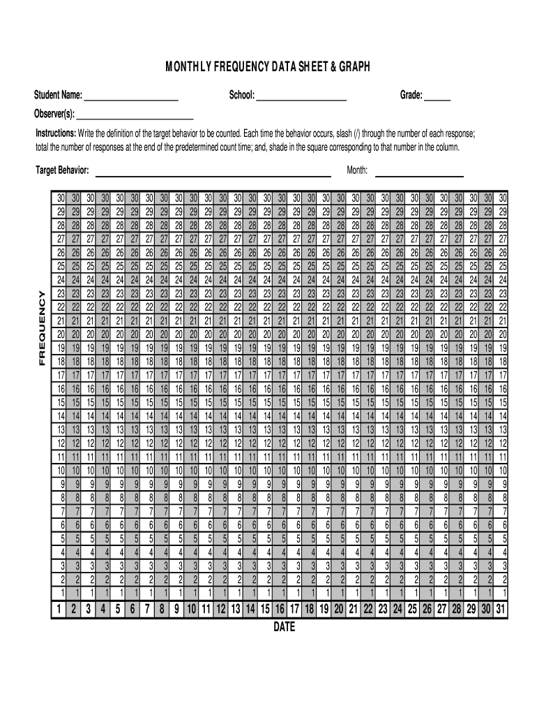
Mn. FREQUENCY Target Behavior: Month: 30 29 28 27 26 25 24 23 22 21 20 19 18 17 16 15 14 13 12 11 10 9 8 7 6 5 4 3 2 1 30 29 28 27 26 25 24 23 22 21 20 19 18 17 16 15 14 13 12 11 10 9 8 7 6 5 4 3 2 1 30 29 28 27 26 25 24 23 22 21 20 19 18 17 16 15 14 13 12 11 10 9 8 7 6 5 4 3 2 1 30 29 28 27 26 25 24 23 22 21 20 19 18 17 16 15 14 13 12 11 10 9 8 7 6 5 4 3 2 1 30 29 28 27 26 25 24 23 22 21 20 19 18 17 16 15 14 13 12 11 10 9 8 7 6 5 4 3 2 1 30 29 28 27 26 25 24 23 22 21 20 19 18 17 16 15 .

Open form follow the instructions

Easily sign the form with your finger

Send filled & signed form or save
How to fill out the Monthly Frequency Data Sheet & Graph online
The Monthly Frequency Data Sheet & Graph is a crucial tool for tracking target behaviors. This guide will help you navigate the online process of filling out this document effectively and accurately.
Follow the steps to complete the Monthly Frequency Data Sheet & Graph online.
- Click ‘Get Form’ button to access the form and open it in your preferred online document editor.
- Begin by entering the student name in the designated field, ensuring correct spelling for accurate record-keeping.
- Next, fill in the school name and grade of the student in their respective sections.
- Identify and list the observers in the provided space, as multiple individuals may be tracking the behavior.
- In the instructions section, write a clear definition of the target behavior you plan to monitor, as this will guide your tracking efforts.
- Count the occurrences of the target behavior. Each time it occurs, place a slash (/) in the corresponding response field.
- At the end of the specified counting period, total the responses recorded and shade in the square that matches this total in the provided columns.
- Double-check all entries for accuracy, ensuring each section is filled properly.
- Once completed, save your changes. You may also download, print, or share the form as needed.
Begin completing the Monthly Frequency Data Sheet & Graph online today.
Experience a faster way to fill out and sign forms on the web. Access the most extensive library of templates available.
Related content
Instructions: Write in the day of the month at the top right of each box. For each box...
Bar graphs, pie charts, and Pareto charts are used to display data. Bar graphs use...
Mar 2, 2006 — Plot Voronoi Diagram: By checking this box, the. Voronoi diagram (or...
Get answers to your most pressing questions about US Legal Forms API.
How to make a graph of frequency in Excel?
Creating a graph of frequency data in Excel is straightforward. First, input your frequency data into a spreadsheet, ensuring you label columns correctly. Then, use the Excel graphing tool to create a Monthly Frequency Data Sheet & Graph by selecting your data and choosing a suitable graph type. This method provides a visual representation of your frequency data, making it easier to analyze and present.
How do you graph frequency data?
Graphing frequency data involves compiling your data in a clear format. For effective visualization, consider utilizing a Monthly Frequency Data Sheet & Graph to categorize and plot your information. You can choose a bar or line graph, depending on your preferences, to showcase frequency changes over time. This approach not only enhances understanding but also aids in analyzing patterns and drawing conclusions.
How do you graph frequency data in ABA?
To graph frequency data in Applied Behavior Analysis (ABA), you typically use a line graph to display changes over time. Start by organizing your frequency data into a Monthly Frequency Data Sheet & Graph. Then, plot the data points directly onto the graph, connecting them with lines to visualize trends. This method allows you to easily interpret the data and make informed decisions based on observed patterns.
How do you fill a frequency chart?
To fill a frequency chart effectively, start by collecting your data over a specific time period. Enter the observed occurrences of the behavior in the designated frequency slots on the Monthly Frequency Data Sheet & Graph. Make sure to label each row or column clearly, as this ensures clarity for anyone reviewing the data later. An accurate chart allows for better tracking and understanding of trends.
How do you make a frequency table on a spreadsheet?
Making a frequency table on a spreadsheet involves organizing your data and using formulas to count occurrences. You can format your table to include categories and their corresponding frequencies. Employing a Monthly Frequency Data Sheet & Graph will allow you to visualize this data clearly, making it easier to analyze trends and inform decisions.
How to create a frequency table?
To create a frequency table, start by determining the categories you want to analyze. Next, tally how many times each category appears in your dataset. For a more organized approach, utilizing a Monthly Frequency Data Sheet & Graph can guide you in arranging your data efficiently while providing visual insights for better understanding.
Can you make a frequency table on Google Sheets?
Yes, you can easily create a frequency table on Google Sheets. Simply input your dataset, then use the built-in functions like QUERY or COUNT to tally occurrences. By integrating these results into a Monthly Frequency Data Sheet & Graph, you will enhance the presentation of your data, providing a visual representation that makes insights more accessible.
How to make a frequency table in a spreadsheet?
Creating a frequency table in a spreadsheet involves listing your data points and counting how often they occur. You can use functions like COUNTIF in Excel or Google Sheets to automate this process. Once you have your data organized, a Monthly Frequency Data Sheet & Graph can help illustrate the findings, making trends easier to spot.
How to graph frequency data in Excel?
To graph frequency data in Excel, first input your data into a spreadsheet, ensuring that it is well organized. Use the built-in chart functions to select a graph type that displays your data effectively, like a bar or line graph. Alternatively, consider utilizing the Monthly Frequency Data Sheet & Graph, which simplifies the graphing process while integrating easily with Excel. This approach can lead to more insightful visualizations.
How to draw a frequency curve graph?
To draw a frequency curve graph, begin by plotting your data points on a traditional graph. The Monthly Frequency Data Sheet & Graph tool can streamline this process by offering automatic graphing options. Once your data is plotted, connect the points with a smooth line to form the curve. This visual tool aids in understanding the distribution and patterns of behavior over time.
Use professional pre-built templates to fill in and sign documents online faster. Get access to thousands of forms.
If you believe that this page should be taken down, please follow our DMCA take down process here.