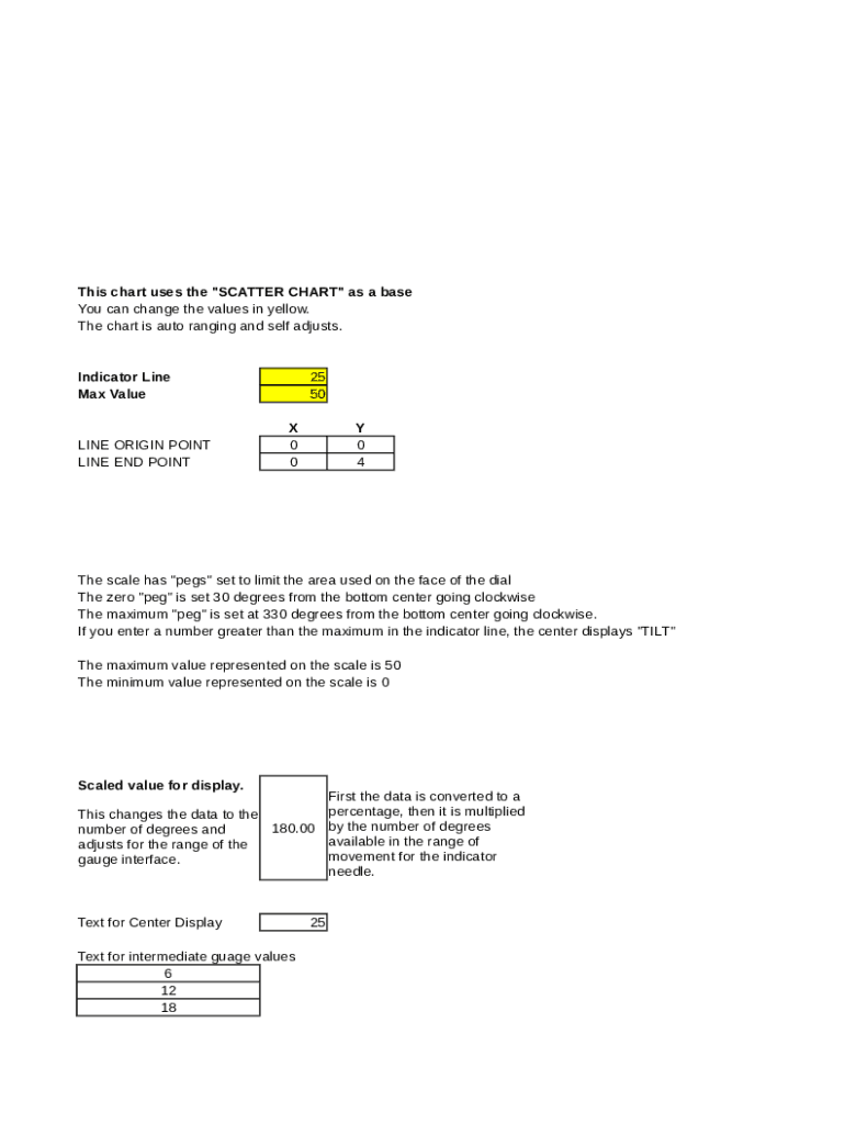
This chart uses the "SCATTER CHART " as a base You can change the values in yellow. The chart is auto ranging and self adjusts.Indicator Line Max ValueLINE ORIGIN POINT LINE END POINT25 50 X 0 0Y 0 4The.
Loading

Open form follow the instructions

Easily sign the form with your finger

Send filled & signed form or save
How to fill out the Dashboard Gauge Chart Template online
Filling out the Dashboard Gauge Chart Template online can enhance your data visualization and reporting process. This guide provides step-by-step instructions to help you effectively complete the template and optimize its use for your needs.
Follow the steps to fill out the Dashboard Gauge Chart Template online.
- Click the ‘Get Form’ button to obtain the form and open it in the editor.
- Identify and locate the fields highlighted in yellow. These are the areas where you can enter specific values related to your data. Adjust the 'Max Value' and 'Indicator Line' by inputting the appropriate numbers.
- Input your desired line origin and end points by adjusting the X and Y coordinates to define the starting and ending locations of the gauge.
- Set the maximum and minimum values represented on the scale, ensuring they align with the data you wish to display. Remember, the maximum scale value is 50 and the minimum is 0.
- Check that the zero 'peg' and maximum 'peg' are positioned correctly; the zero peg should be set 30 degrees clockwise from the bottom center, and the maximum peg should be at 330 degrees.
- Ensure that the scaled value calculations are correct; this involves converting the entered data into a percentage and then adjusting it to reflect the range in the gauge interface.
- Enter any additional text for the center display or for intermediate gauge values, filling in those fields as necessary.
- Once you have completed all necessary fields, save your changes and choose whether to download, print, or share the completed template.
Start completing your Dashboard Gauge Chart Template online to visualize your data effectively.
Experience a faster way to fill out and sign forms on the web. Access the most extensive library of templates available.
Related content
The Infographic widget provides 16 graphic templates you can use to ... Charts widget...
these charts in our Excel dashboards course. Gauge Charts. Dashboard Creation in Excel...
Sep 8, 2017 — ServiceNow reports can be lists, charts, or calendar-based views of data...
Get answers to your most pressing questions about US Legal Forms API.
How do I create a KPI dashboard with gauge control in Excel?
0:24 2:20 Suggested clip Create Gauge Charts in Excel - Ultimate KPI Dashboard Tools ...YouTubeStart of suggested clipEnd of suggested clip Create Gauge Charts in Excel - Ultimate KPI Dashboard Tools ...
How do I create a dashboard dial in Excel?
First of all, go to Insert Tab Charts Doughnut Chart (with this you'll get a blank chart). Now, right-click on the chart and then click on Select Data . In the Select Data window, click on Legend Entries and enter Category in the name input bar.
How do you make a gauge chart in Google Sheets?
On your computer, open a spreadsheet in Google Sheets. Double-click the chart you want to change. At the right, click Customize. Choose an option: Chart style: Change background color, font, or maximize gauge size. Gauge: Add and edit gauge ranges. Chart & axis titles: Edit or format title text.
How do I create a dashboard gauge in Excel?
Specify the value range and parts you want the speedometer chart shown! ... Go to the Insert Tab on the ribbon and in the Charts Group, click to Create Custom Combo chart icon to create the default chart. Choose Doughnut as the chart type. ... Click to OK button!
How do you use gauge charts in Google Sheets?
On your computer, open a spreadsheet in Google Sheets. Double-click the chart you want to change. At the right, click Customize. Choose an option: Chart style: Change background color, font, or maximize gauge size. Gauge: Add and edit gauge ranges. Chart & axis titles: Edit or format title text.
How do you use gauges in Excel?
Select the range H2:I6. ... On the Insert tab, in the Charts group, click the Combo symbol. Click Create Custom Combo Chart. ... For the Donut series, choose Doughnut (fourth option under Pie) as the chart type. For the Pie series, choose Pie as the chart type. Plot the Pie series on the secondary axis. Click OK.
How do you use a gauge chart?
If you have a linear range of progressive information and you want to depict how it changes. It is often used is sales and marketing to depict targets and how much it has been achieved. Gauge charts are extensively used in project management to define deadlines, modules, and related details.
How do I create a gauge chart in Excel?
Click on the Doughnut chart. Click the DESIGN tab on the Ribbon. Click Select Data in the Data group. Select Data Source dialog box appears. Click the Add button.
How do you create a speedometer chart in PowerPoint?
0:32 12:23 Suggested clip How to Create STUNNING Speedometer Chart Template in ...YouTubeStart of suggested clipEnd of suggested clip How to Create STUNNING Speedometer Chart Template in ...
How do I create a fancy dashboard in Excel?
5:43 11:43 Suggested clip How to Create Dashboard in Excel - YouTubeYouTubeStart of suggested clipEnd of suggested clip How to Create Dashboard in Excel - YouTube
Use professional pre-built templates to fill in and sign documents online faster. Get access to thousands of forms.
If you believe that this page should be taken down, please follow our DMCA take down process here.