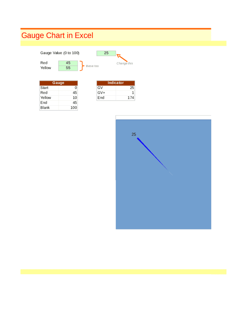
Gauge Chart in Excel Gauge Value (0 to 100) Red Yellow45 5525 these tooGauge Start Red Yellow End BlankChange thisIndicator 0 45 10 45 100GV GV+ End25 1 1742525.

Open form follow the instructions

Easily sign the form with your finger

Send filled & signed form or save
How to fill out the Et Using A Gauge Chart online
In this guide, we will provide clear and detailed instructions for filling out the Et Using A Gauge Chart online. This document is designed to help users effectively complete the form while maximizing the use of its components.
Follow the steps to effectively fill out the Gauge Chart form
- Click the ‘Get Form’ button to obtain the form and open it in the designated editing space.
- Begin by entering the gauge value, which should be a number between 0 and 100, in the designated field labeled 'Gauge Value'. This value will determine the position of the indicator on the gauge chart.
- Next, configure the colors for the gauge. You will see sections designated for 'Red' and 'Yellow' in relation to their corresponding values. Assign values that will represent these segments of the gauge.
- Then, set the 'Start' and 'End' values for the gauge. This defines the range of the chart and effectively illustrates the low and high limits.
- Utilize the 'Indicator' section to capture specific values at which you want to display the needle on the gauge. Ensure that this value aligns with the previously set gauge value.
- After filling out the necessary fields, review all entries for accuracy. Make any required adjustments to ensure correctness and clarity.
- Finally, you can save your changes, download the completed form, print it for physical use, or share it as necessary.
Complete your documents online with ease and efficiency!
Experience a faster way to fill out and sign forms on the web. Access the most extensive library of templates available.
Related content
A basic understanding of the practices of public health and biostatistics is recommended...
This NebGuide describes the atmometer (evapotranspiration gage) and ... To use the chart...
Vapor pressure or equilibrium vapor pressure is defined as the pressure exerted by a vapor...
Get answers to your most pressing questions about US Legal Forms API.
Why would you use a gauge chart?
Gauge charts are extensively used in project management to define deadlines, modules, and related details. They are also used in finance and economics to represent statistics and researched details.
How do I create a performance chart in Excel?
Step 1: Enter Data into a Worksheet. ... Step 2: Select Range to Create Chart or Graph from Workbook Data. ... Step 1: Select Chart Type. ... Step 2: Create Your Chart. ... Step 3: Add Chart Elements. ... Step 4: Adjust Quick Layout. ... Step 5: Change Colors. ... Step 6: Change Style.
How do I create a gauge chart in Excel?
Click on the Doughnut chart. Click the DESIGN tab on the Ribbon. Click Select Data in the Data group. Select Data Source dialog box appears. Click the Add button.
How do you use gauges in Excel?
Select the range H2:I6. ... On the Insert tab, in the Charts group, click the Combo symbol. Click Create Custom Combo Chart. ... For the Donut series, choose Doughnut (fourth option under Pie) as the chart type. For the Pie series, choose Pie as the chart type. Plot the Pie series on the secondary axis. Click OK.
How do you use a gauge chart?
Select the range H2:I6. ... On the Insert tab, in the Charts group, click the Combo symbol. Click Create Custom Combo Chart. ... For the Donut series, choose Doughnut (fourth option under Pie) as the chart type. For the Pie series, choose Pie as the chart type. Plot the Pie series on the secondary axis. Click OK.
How do you use gauge charts in Google Sheets?
On your computer, open a spreadsheet in Google Sheets. Double-click the chart you want to change. At the right, click Customize. Choose an option: Chart style: Change background color, font, or maximize gauge size. Gauge: Add and edit gauge ranges. Chart & axis titles: Edit or format title text.
How do I create a gauge chart in tableau?
1:04 8:27 Suggested clip Chartbusters: Gauge Chart in Tableau - YouTubeYouTubeStart of suggested clipEnd of suggested clip Chartbusters: Gauge Chart in Tableau - YouTube
What is a gauge chart used for?
What is a Gauge Chart? Also known as a speedometer chart or a dial chart, a gauge chart is one of the most commonly used visual tools to represent progressive values. The chart looks like a speedometer or a dial (in most of the cases) with a needle pointing to a certain value over the pivot point.
How do I create a KPI dashboard with gauge control in Excel?
0:24 2:20 Suggested clip Create Gauge Charts in Excel - Ultimate KPI Dashboard Tools ...YouTubeStart of suggested clipEnd of suggested clip Create Gauge Charts in Excel - Ultimate KPI Dashboard Tools ...
Use professional pre-built templates to fill in and sign documents online faster. Get access to thousands of forms.
If you believe that this page should be taken down, please follow our DMCA take down process here.