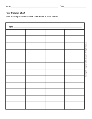
Column. Add details to each column. Copyright © Houghton Mifflin Company. All Rights Reserved. Topic .

How it works
  • Open form

    Open form follow the instructions

  • Easily sign form

    Easily sign the form with your finger

  • Share form

    Send filled & signed form or save

How to fill out the Houghton Mifflin Four Column Chart online

The Houghton Mifflin Four Column Chart is an organized way to display information across multiple categories. This guide will walk you through each section of the form, providing you with clear instructions to complete it effectively.

Follow the steps to successfully complete the Four Column Chart.

  1. Press the 'Get Form' button to acquire the form and launch it in your editing tool.
  2. In the first column, titled 'Topic,' enter the main subject or title you wish to address in your chart.
  3. For the second column, provide relevant details or notes that relate to the topic you entered in the first column.
  4. In the third column, continue adding supplementary information or insights that further expand on the topic.
  5. Finally, fill out the fourth column with any additional observations or related concepts that may enrich the discussion.
  6. Once all columns are completed, you may choose to save your changes, download a copy, print the form, or share it as needed.

Start filling out your documents online today for a streamlined experience.

Get form

Experience a faster way to fill out and sign forms on the web. Access the most extensive library of templates available.

Related content

Houghton Mifflin Harcourt Grade 4 English Language...

This activity can be found under Options for Differentiation, which “guides students to...

Learn more
Charts and Tables for Instruction

This example of a number line was developed by Loraine McMillan and sold by Houghton...

Learn more
word processor - wp-800mds wp-900mds wp-1700mds

Aug 21, 2020 — These numbers can be found on the rear panel of the word processor. MODEL...

Learn more
Questions & Answers

Get answers to your most pressing questions about US Legal Forms API.

Contact support

How do I create a column chart in Word?

To create a column chart in Word, you'll first need to navigate to the 'Insert' tab and select 'Chart'. Choose 'Column Chart' from the options provided. Then, enter your data into the Excel spreadsheet that opens up. This allows for a clear presentation of your information, just like the Houghton Mifflin Four Column Chart, enhancing your document's impact.

Making a column chart involves a few simple steps. Begin by arranging your data with categories and corresponding values. Next, select your data and access the 'Insert' tab, where you can choose 'Column Chart'. This visual representation helps you analyze trends, much like the Houghton Mifflin Four Column Chart does.

You can create a column chart by preparing your data in a structured format. After organizing your data, highlight it and go to the 'Insert' menu, where you'll find the option for 'Column Chart'. By doing this, you effectively illustrate your data comparisons, akin to the presentation style of the Houghton Mifflin Four Column Chart.

Creating a chart in Excel with multiple columns is straightforward. First, prepare your dataset with the desired categories in the first column and your values in the following columns. Highlight this data, navigate to the 'Insert' tab, and select 'Column Chart'. This can visually summarize your information, similar to using the Houghton Mifflin Four Column Chart.

To create a column chart sheet, start by organizing your data in a table format. Input your categories in one column and your values in the adjacent columns. Once your data is ready, highlight the entire table. Then, select the 'Insert' tab and choose 'Column Chart'. This method effectively showcases your data, much like the Houghton Mifflin Four Column Chart.

A clustered column chart displays values in 2-D vertical rectangles. A clustered column in a 3-D chart displays the data by using a 3-D perspective. Stacked column chart Shows the relationship of individual items to the whole, comparing the contribution of each value to a total across categories.

Column charts are useful for showing data changes over a period of time or for illustrating comparisons among items. In column charts, categories are typically organized along the horizontal axis and values along the vertical axis.

A column chart is a method of displaying data with categories represented by a rectangle—sometimes called vertical bar charts. They allow easy comparisons among a number of items and trends analysis. In general, statistics and figures are difficult to understand when presented in tables or written format.

Get This Form Now!

Use professional pre-built templates to fill in and sign documents online faster. Get access to thousands of forms.

If you believe that this page should be taken down, please follow our DMCA take down process here.

Get Houghton Mifflin Four Column Chart